
A sales performance metrics dashboard is your team's command center. Forget static spreadsheets; this is a live, visual hub that pulls together all your key sales data. It turns raw numbers from your CRM and other tools into clear insights, showing your team exactly where they stand against their goals in real-time. That immediate clarity is what enables you to manage proactively, not reactively.
Why Your Sales Team Needs More Than Just Reports
Let's be real—those weekly spreadsheets just don't cut it anymore.
Picture this: a sales manager is drowning in reports, trying to stitch together a picture of team performance from last week's data. By the time they spot a dip in the win rate, the month is nearly over. The window to fix the problem has slammed shut. This is the frustrating, reactive cycle that so many teams get stuck in.
This scenario gets right to the heart of why we need to move from passive reporting to active performance management. A sales performance metrics dashboard isn't just a shiny new toy; it's a strategic must-have. It acts as the single source of truth, giving your team the live data they need to make smart decisions on the fly.
From Lagging Indicators to Leading Insights
The biggest issue with traditional reports is the time lag. The information is often days, or even weeks, old. Every metric becomes a lagging indicator—you're always looking in the rearview mirror. In the fast-moving world of B2B SaaS, that delay can be incredibly costly.
The numbers don't lie. With a shocking 84% of sales reps missing their quotas last year, it's clear that teams need better tools for tracking performance. When you swap out static reports for an automated, interactive dashboard, you can monitor critical KPIs like pipeline health, win rates, and quota attainment every single day. You can find more insights on sales performance at Everstage.com.
Visualize Success in Real Time
A great dashboard does more than just show you data; it tells a story. It translates complex numbers into clear, visual charts that anyone on the team can understand in seconds.
A dashboard should be a conversation starter, not just a data dump. It's what helps you ask smarter questions, like, "Why did our deal velocity slow down this week?" or "Which lead source is bringing in the most qualified opportunities?"
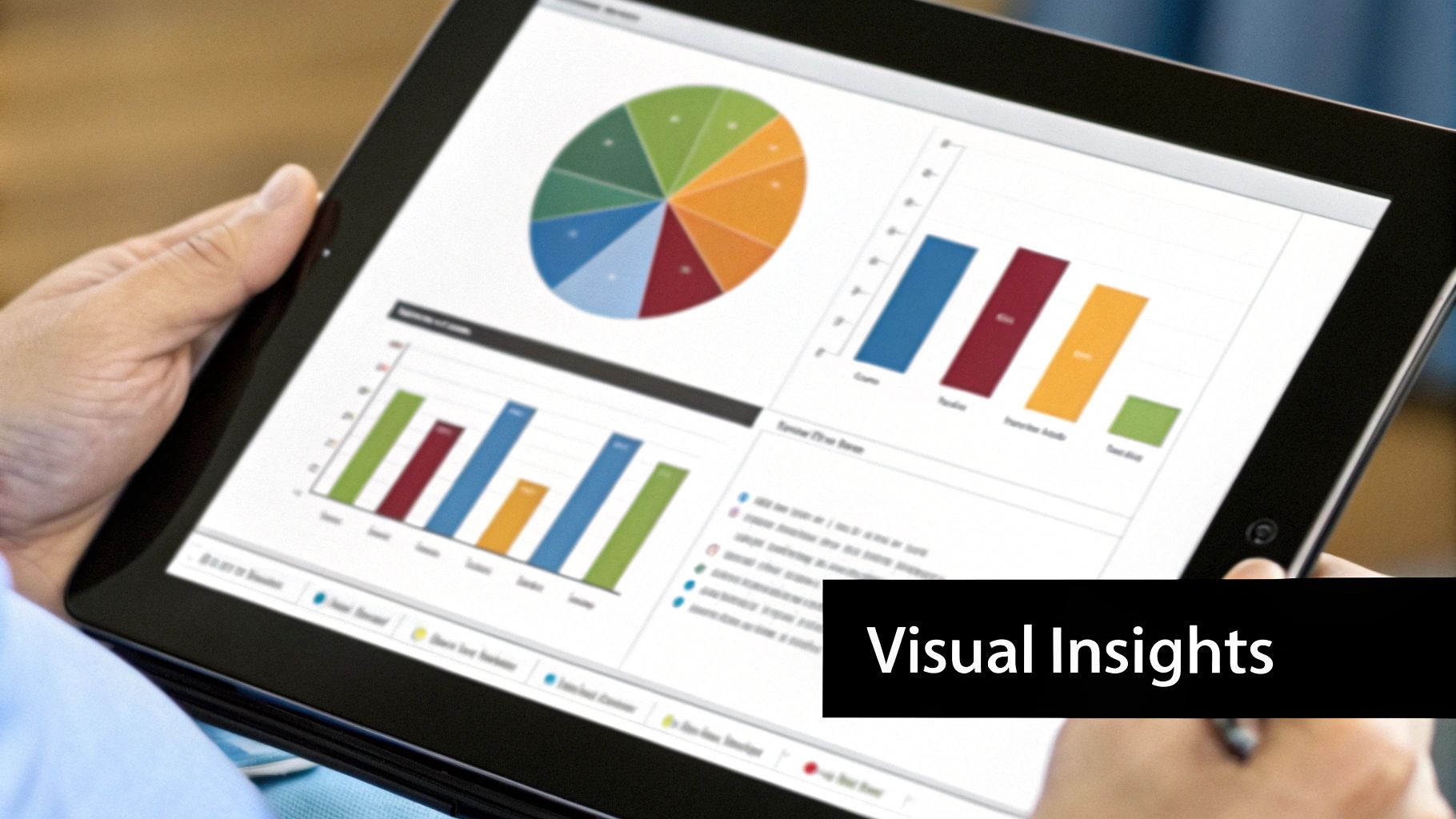
This dashboard is a perfect example of visualizing key data points effectively.

As you can see, a manager can immediately spot regional performance trends, check profit ratios, and see which product categories are driving sales. It’s all there at a glance.
Ultimately, this visual approach helps your team in a few huge ways:
- Spot Gaps Proactively: You can see declining activity or a thinning pipeline long before it becomes a full-blown crisis.
- Jump on Opportunities: It becomes easy to see which strategies are paying off so you can double down on what works.
- Fire Up the Team: Clear, transparent goals and celebrating wins as they happen creates a culture of accountability and success.
Choosing Sales Metrics That Actually Matter

When it comes to sales dashboards, more is not better. A cluttered dashboard quickly becomes a useless one, packed with vanity metrics that don't tell you anything about what's actually driving revenue. The real goal isn't to track everything you possibly can; it's to track the right things.
To get a complete picture of your sales engine, it’s best to break your metrics down into three core categories. This approach helps you connect your team's daily efforts to the health of your pipeline and, ultimately, your bottom-line results.
- Activity Metrics: These are your inputs—the raw effort your sales team is putting in.
- Pipeline Metrics: This is the engine room—tracking the health and flow of deals through your process.
- Outcome Metrics: These are your outputs—the final results that matter to the business.
Measuring Quality Activity, Not Just Volume
It's an old trap, but one that teams fall into all the time: focusing on "calls made" or "emails sent." While those numbers show your team is busy, they don't tell you if they're being effective. A high-impact dashboard cuts through the noise and measures the quality of those interactions.
Instead of just counting raw activity, start tracking metrics that signal real progress:
- Meaningful Conversations: This is a game-changer. It shifts the focus from just dialing numbers to having substantive discussions with qualified prospects. It's about quality over quantity.
- Meetings Booked: A booked meeting is a clear sign that a rep's outreach is hitting the mark. It's a critical first "yes" in any B2B SaaS sales cycle.
- Demos Completed: For most SaaS companies, the demo is where a prospect truly sees the value. This metric tells you exactly how many potential customers are getting a serious look at your solution.
Tracking the Health and Speed of Your Pipeline
Your sales pipeline is the lifeblood of your business. The metrics you choose here need to give you a clear, real-time snapshot of its health, momentum, and any potential roadblocks. Remember, a healthy pipeline isn't just full—it moves.
A slow pipeline can be just as dangerous as an empty one. Tracking velocity helps you spot bottlenecks where deals are stalling, giving you a chance to intervene before forecasts are missed.
Here are a few pipeline metrics that are non-negotiable:
- Lead Response Time: In the world of SaaS, speed is everything. The faster your team follows up with an inbound lead, the higher the conversion rate. It’s that simple.
- Pipeline Velocity: This is a powerful metric that shows how quickly deals are moving from start to finish. It helps you understand the overall efficiency of your sales process and forecast more accurately.
- Stage-by-Stage Conversion Rate: Where are deals falling out of your funnel? By tracking conversion rates at each stage, you can pinpoint specific weaknesses in your sales process and address them with targeted coaching.
Focusing on Real Business Outcomes
At the end of the day, all the calls, demos, and pipeline management have to lead to tangible business results. Outcome metrics are the numbers that the C-suite and the board truly care about. They tell the story of whether your sales strategy is profitable and built to last.
Your sales performance dashboard absolutely must include these outcomes:
- Win Rate: This is the ultimate measure of your team's closing ability—the percentage of qualified opportunities that become closed-won deals.
- Customer Acquisition Cost (CAC): This metric calculates the total sales and marketing investment required to land a new customer. A sustainable SaaS business has to keep its CAC under control to ensure long-term profitability. For a deeper dive, check out our guide on how to calculate SaaS customer acquisition cost.
To help you get started, we've organized these crucial metrics into a simple table. Think of this as your starting blueprint for building a dashboard that drives real-world results.
Essential B2B SaaS Sales Metrics
| Metric Category | Key Metric | What It Measures | Business Question Answered |
|---|---|---|---|
| Activity | Meetings Booked | The number of initial meetings or demos scheduled with qualified leads. | Is our outreach effective at capturing prospect interest? |
| Activity | Demos Completed | The number of product demonstrations delivered to potential customers. | Are we getting our product in front of enough qualified buyers? |
| Pipeline | Lead Response Time | The average time it takes for a sales rep to follow up with a new lead. | Are we engaging with potential customers quickly enough to win? |
| Pipeline | Pipeline Velocity | The speed at which deals move through the sales funnel. | How efficient is our sales process from lead to close? |
| Pipeline | Stage Conversion Rates | The percentage of deals that advance from one sales stage to the next. | Where are the biggest bottlenecks or weaknesses in our sales process? |
| Outcome | Win Rate | The percentage of sales opportunities that result in a closed-won deal. | How effective is our team at closing qualified opportunities? |
| Outcome | Customer Acquisition Cost (CAC) | The total cost of sales and marketing to acquire a single new customer. | Is our customer acquisition strategy profitable and sustainable? |
Using this framework ensures you're not just tracking data for the sake of it. Each metric on your dashboard should directly answer a critical business question, giving you the clarity needed to lead your team effectively.
Building Your Dashboard From the Ground Up
Let’s be honest, building a great sales dashboard isn't about buying the most expensive software. It’s about being thoughtful and strategic from the very start. The whole process hinges on a solid foundation, which really just means knowing exactly where your most important sales data lives.
For almost every B2B SaaS team I've worked with, this data is scattered across a few usual suspects. Your CRM—whether it's Salesforce or HubSpot—is your command center. It holds the keys to the kingdom: deal stages, contact details, and every single sales activity. But don't forget about your marketing automation platform or even those trusty spreadsheets; they often hold valuable pieces of the puzzle.
Before you even think about charts and graphs, you have to tackle data hygiene. This is the part everyone wants to skip, but it’s non-negotiable. If your CRM data is a mess, your shiny new dashboard will just be a pretty way of looking at garbage. Insist that your team consistently logs their activities, keeps deal stages updated, and tracks leads properly. If you need some pointers, we have a detailed guide on how to track sales leads that can help.
Turning Raw Numbers into Clear Visuals
Once your data is clean and your sources are connected, the fun part can begin: making the data tell a story. The goal here is to pick a chart type that communicates the insight you need in a single glance. Please, don't just use a bar chart for everything. You have to match the visual to the metric.
Here are a few of my go-to choices:
- Funnel Charts: These are absolutely perfect for visualizing your sales pipeline. You can instantly see where deals are falling through, which helps you pinpoint bottlenecks. Are you losing people between the "Demo Completed" and "Proposal Sent" stages? A funnel chart will scream it at you.
- Gauge Charts: Think of the speedometer in your car. Gauges are brilliant for tracking progress toward a specific target, like an individual or team quota attainment. A rep can look at it and know in a second exactly how close they are to hitting their number.
- Line Charts: When you need to understand trends over time, nothing beats a simple line chart. Use it for tracking things like sales volume or pipeline growth month-over-month. It’s the best way to see if you’re building momentum or starting to stall.
This whole process—connecting data, cleaning it up, and loading it into a visual dashboard—is the fundamental workflow.
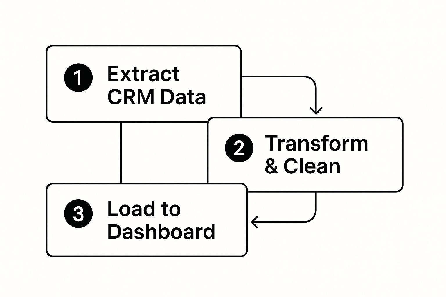
This graphic breaks down that essential journey, taking your data from its raw form all the way to a clean, final presentation.
One Dashboard Does Not Fit All
One of the biggest mistakes I see teams make is building a single, generic dashboard for everyone. That just doesn’t work. A sales rep, a sales manager, and a VP of Sales all have different jobs and need different information. This is where creating role-based views is a game-changer.
Think about designing your dashboard with a logical flow that tells a story. Start high-level at the top—show the big outcomes like Total Revenue or the overall Win Rate. Then, move down into the health of the pipeline, and finally, drill into the specific, granular activities that drive those results.
An effective dashboard doesn't just show you numbers; it guides your eye from the 'what' to the 'why.' It should create a natural path from a top-level result down to the individual activities that got you there.
By creating tailored views, you make sure every person on the team gets the insights they need without getting bogged down by data that isn't relevant to them. A rep can focus on their personal activity and pipeline, a manager can see team-wide performance, and an executive gets the 30,000-foot view of regional or global trends. It makes the data actionable for everyone.
Analyzing Your Pipeline for Hidden Revenue
Think of your sales pipeline as the engine driving your revenue. If it's running smoothly, you hit your numbers. If it sputters, you miss. Your dashboard is the diagnostic tool that lets you see exactly what's happening under the hood.
A good dashboard gives you a live, visual map of the entire journey—from a new lead all the way to a closed deal. This means you can spot problems before they blow up your forecast, not after the quarter is already over. It helps your team shift from just reacting to fires to proactively fixing the leaks that drain your revenue.
Diagnosing Your Funnel with Key Metrics
To get a real sense of your pipeline's health, you have to look deeper than the total dollar value. A great dashboard lets you slice and dice your funnel to check its vital signs.
Here are the critical health indicators you should have front and center:
- Stage-by-Stage Conversion Rates: This is your early warning system. It shows you the percentage of deals moving from one stage to the next. It’s the fastest way to pinpoint exactly where deals are getting stuck.
- Average Sales Cycle Length: How long does it take, on average, to close a deal? If this number starts creeping up, you've got friction in your sales process that needs immediate attention.
- Average Deal Size: Is your average deal getting bigger or smaller? Tracking this makes sure your team is spending their time on the high-value opportunities that actually move the needle.
I’ve seen it a hundred times: a huge drop-off in conversions right after the product demo. That tells me instantly there's a gap between what prospects see and the value they need to feel to move forward. A dashboard makes that problem impossible to ignore.
This is why a dashboard is so powerful. It helps you stop guessing and start asking the right questions, like, "Why are we losing 25% of our deals right after we send the proposal?" Finding the answer to that is how you fix expensive problems.
From Lead Volume to Pipeline Coverage
A healthy pipeline isn't just about the deals you're working on now. It's about having a steady stream of new opportunities coming in to keep the engine fueled for the future. Your dashboard needs to show you the flow of leads as they move through the qualification process.
You should be tracking:
- Marketing Qualified Leads (MQLs): The raw number of leads coming in from marketing.
- Sales Accepted Leads (SALs): How many of those MQLs your sales team actually agrees are worth their time.
- Sales Qualified Leads (SQLs): The leads who have been properly vetted and are now considered real, active opportunities.
Keeping a close eye on the MQL-to-SQL flow is absolutely essential for accurate forecasting. A solid understanding of your pipeline is everything, and you can get more practical tips from our guide on how to build a powerful sales pipeline.
This detailed stage-by-stage tracking isn't just a nice-to-have; it's what the best B2B companies do. They monitor every step—from initial contact and lead nurturing to the proposal discussion—to maintain total visibility. In fact, companies that do this well often see their revenue grow 11% faster than competitors who are flying blind.
Turning Your Dashboard Data Into Action
Let's be honest, a beautiful dashboard that nobody uses is just a pretty picture. It's completely useless if it doesn't actually drive change. The whole point is to turn that data into real-world action, weaving it into the very fabric of your team's day-to-day.
Think of it this way: your dashboard shouldn't be a passive report you glance at once a week. It needs to become an active, living part of your sales culture. This starts by putting it front and center in your team meetings.
Ditch the old spreadsheets. Project the live dashboard during your daily huddles. You can quickly go over yesterday's activity metrics and give shout-outs for quick wins. This gets everyone on the same page and keeps them focused on the daily inputs that lead to those bigger results.
From Reporting to Coaching
The real magic happens when you bring the dashboard into your weekly 1-on-1s. This is where you graduate from simply reviewing numbers to having genuinely strategic, data-backed conversations. It's your chance to dig into the "why" behind what's happening.
Instead of generic feedback, you can get incredibly precise. Picture a conversation with one of your reps: "Hey, I noticed your lead-to-opportunity conversion rate is a bit lower this month, but your call volume is solid. Let's pull up your initial outreach scripts and see if we can sharpen the value prop together."
See the difference? This approach transforms a potentially awkward chat into a collaborative, problem-solving session. The data takes the emotion and guesswork out of it, allowing you both to zero in on a specific skill or process that needs a tune-up.
Your dashboard should be the starting point for every single coaching conversation. It gives you the objective proof you need to pinpoint weaknesses, spot skill gaps, and—just as importantly—celebrate strengths with hard numbers.
Using Trends to Steer the Ship
Beyond coaching individual reps, your dashboard is your crystal ball for strategic planning. When you start analyzing trends over weeks and months, you can stop reacting and start making smart, proactive decisions for the whole team.
This is where you can make some powerful adjustments:
- Fine-Tuning Your Strategy: You might notice that deals from a specific lead source consistently close faster. That's a clear signal to double down and put more resources into that channel.
- Spotting Training Gaps: Is the whole team getting stuck after the proposal stage? That’s your cue to schedule some focused training on negotiation or closing techniques.
- Optimizing Territories: The data might show that one territory is drowning in leads while another is a desert. That's an obvious sign that you need to rebalance assignments for better coverage.
Ultimately, this is about a cultural shift. Your dashboard stops being a tool for looking in the rearview mirror and becomes the compass that guides everything you do moving forward. It’s what builds a true culture of continuous improvement and strategic action.
Got Questions? We’ve Got Answers.
Rolling out a new sales dashboard is a great move, but let's be real—it's never as simple as just flipping a switch. Questions always pop up. Here are a few common ones I’ve heard over the years, along with some straight answers to help you sidestep the usual pitfalls.
How Do I Get My Skeptical Team on Board?
This is the big one. It’s rarely the tech that trips you up; it’s the people. Sales reps can get nervous about anything that feels like a new way to be micromanaged.
The secret is to flip the script. Don't introduce it as a tool for management. Introduce it as a tool for them.
Show them how having a clear view of their pipeline helps them spot the hottest deals and stop wasting time on long shots. Frame it as their personal scoreboard, designed to help them crush their quota and, most importantly, their commission checks. When they realize it helps them make more money, that skepticism tends to vanish pretty quickly.
The conversation needs to be about empowerment, not oversight. This dashboard is a resource to help reps close more deals, period. It's not just a new way for leadership to keep tabs on them.
What’s the Difference Between Inside and Outside Sales Metrics?
Great question. While everyone cares about the big numbers like Win Rate and Quota Attainment, you can't just slap the same KPIs on both your inside and outside sales dashboards. Their daily jobs are completely different, and their metrics need to reflect that reality.
-
For Inside Sales: It’s all about volume and speed. Their dashboards should be loaded with activity metrics. Think Dials per Day, Meaningful Conversation Rate, and especially Lead Response Time. Their sales cycles are short and furious, so tracking pipeline movement on a daily or weekly basis is key.
-
For Outside Sales: The focus shifts from quantity to quality. These reps are playing the long game with bigger, more complex deals. Their dashboards should highlight things like Strategic Meetings Booked, Average Deal Size, and Sales Cycle Length. Each activity is a bigger investment, so the metrics need to track that high-stakes progress.
How Do I Pull in Data from All Our Different Tools?
This sounds like a technical nightmare, but it's gotten a lot easier. Modern dashboard platforms are built for this. The goal is to create one single source of truth by connecting your CRM, marketing automation, and maybe even your accounting software.
Your CRM is the sun in this solar system—everything revolves around it. Start there. Look for a dashboard tool that has ready-made integrations with platforms like Salesforce or HubSpot. These connectors do most of the heavy lifting for you. If there isn't a pre-built option, an API connection is your next best bet.
But here’s a pro tip: don't try to boil the ocean. Start small. Connect your CRM and just one other critical tool first. Get that link working perfectly and make sure the data is clean. Once you've nailed that, you can start adding more sources. It’s a much saner approach that ensures you’re building on a solid foundation.